Credit: icon found at Digik.NET
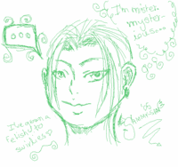
Yup, that's right. I have but only two sucky doodles to show... So pitiful, me knows. The first one I did yesterday. I was kinda bored and... yeah. At first I was a bit proud of it, but now that I look at it again, I think it looks hideous. It's plain full of mistakes. T__T
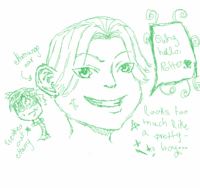
 The second one I did half an hour ago. Yeah, it's supposed to be Malfoy there. And the little head back there is Harry (Yeah, with no glasses. Maybe they fell off from the shock.) I drew it more for amusement than anything else.
Uh... I guess this post was a waste of time. Oh well~♥ (Psst. It's probably obvious, but click on the images to get a bigger version.)
P.S. Scratch that "he looks too much like a pretty boy" thing. Now that I look at it again, he just looks like a kid. *snort*

1 said miss mademoiselle:
I like your drawings....but why are they green? Lol. You know, one thing I think you should add, is more hair. Like maybe make a few haircuts that reach past the character's ears, you know? Or like the guy on your awesome "cynical" icon - you could experiment drawing flowy long hair like that (I wish I could draw hair like the guy's hair on that icon!)
Post a Comment